
Custom theme
How to get your custom theme on Confirmo invoice page.
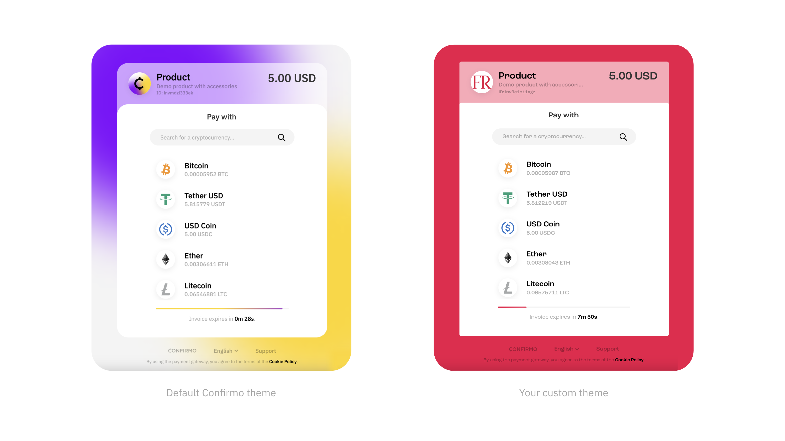
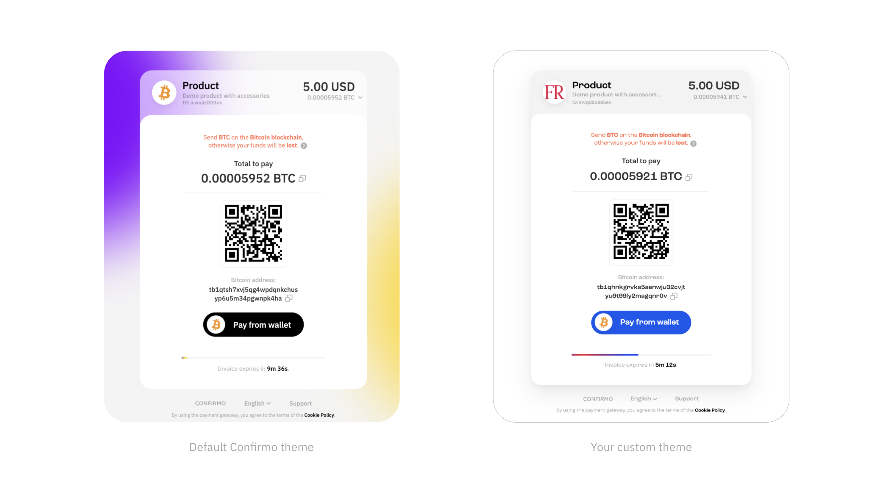
Confirmo offers customization options for styling the Confirmo Invoice page using CSS variables. You can adjust the defined variables to apply your brand identity and optionally include your custom logo and fonts.
Custom theme examples
General information
How to apply for a custom theme?
-
Define your styling in the Custom theme template and send it to us.
All CSS variables listed in the template must be defined, otherwise values from the default Confirmo theme will be used. Optional assets like logos, fonts or background images should be included in a
.zipfile along with the Custom theme template when submitting. -
Your styling will be revised and we will send you a new appearance of your Confirmo invoice pages for approval.
-
Once confirmed, your custom styling is good to go and will be applied.
Custom theme template
/*
* This is the template for customizing the styling of the Confirmo Public Invoice.
*
* All variables below must be defined. Optionally, you can also include your custom
* font and company logo - please send all required files in a .zip archive together with this file.
*/

:root {
  /* Defines the background - this can be either a solid color or an image.
  *  If using an image, please also include the image file.
  */
  --cf-pi-background: #c4c4c4; /* or url('your-image.png') */

  /* Defines the hover color for the Asset (Step 1) and Network (Step 2) selection buttons */
  --cf-pi-select-button-hover-color: #c4c4c4;

  /* The primary or contrast color of your brand.
  *  Used for accent elements such as the back button hover effect.
  */
  --cf-pi-contrast-color: #8100ff;

  /* Defines the color of the "Pay from wallet" button.
  *  You can reuse the contrast color, as shown in the example.
  */
  --cf-pi-pay-button-color: var(--cf-pi-contrast-color);

  /* Color of the text for "Pay from wallet" button. */
  --cf-pi-pay-button-text-color: #ffffff;

  /* Primary color of the progress bar (time remaining indicator) */
  --cf-pi-progress-bar-color-primary: var(--cf-pi-contrast-color);

  /* Secondary color of the progress bar.
  *  Used to create a subtle "floating" animation.
  */
  --cf-pi-progress-bar-color-secondary: rgb(from var(--cf-pi-contrast-color) r g b / 0.8);

  /* Background color for the unfilled part of the progress bar */
  --cf-pi-progress-bar-color-bg: #0000004c;

  /* Color of the footer text - should contrast with the background color */
  --cf-pi-footer-text-color: #000000;

  /* Border radius for the Public Invoice card */
  --cf-pi-card-border-radius: 25px;

  /* Border radius for the Public Invoice card on mobile devices (width < 750px) */
  --cf-pi-card-border-mobile-radius: 18px;
}

/* OPTIONAL CUSTOMIZATION
*
* 1. Logo
*    The logo displayed in the header of the Public Invoice.
*    Requirements:
*    - Square format
*    - .svg, .png, or .jpg file
*    - Maximum size: 140x140 px
*
* 2. Font
*    Please provide the font in three weights (ideally in both .woff and .woff2 formats):
*    - Weight 400 (Regular)
*    - Weight 500 (Medium)
*    - Weight 600 (SemiBold or Bold)
*/
CSS variables overview
Background
--cf-pi-background: #c4c4c4;Defines the background of the invoice. You can set a solid color or use an image (image file must be included).
Image file requirements: .svg or high-res .png, jpg
Select button hover color
--cf-pi-select-button-hover-color: #c4c4c4;Color displayed when hovering over buttons for Asset and Network selection.
Contrast color
--cf-pi-contrast-color: #8100ff;Primary color used for branding accents, such as hover effects on the back button and other UI elements.
Pay from wallet button
 --cf-pi-pay-button-color: var(--cf-pi-contrast-color);
 --cf-pi-pay-button-text-color: #ffffff;
Color of the "Pay from Wallet" button and its text. You can reuse the contrast color, as shown in the example.
Progress bar colors
--cf-pi-progress-bar-color-primary: var(--cf-pi-contrast-color);
--cf-pi-progress-bar-color-secondary: rgb(from var(--cf-pi-contrast-color) r g b / 0.8);
--cf-pi-progress-bar-color-bg: #0000004c;- Primary: Main fill color of the time remaining indicator.
- Secondary: Used to create a subtle "floating" animation.
- Background: Unfilled portion of the progress bar.
Footer text
--cf-pi-footer-text-color: #000000;Sets the color of the footer text, ensuring readability against the background.
Card border radius
--cf-pi-card-border-radius: 25px;
--cf-pi-card-border-mobile-radius: 18px;
Defines the border radius of the invoice content.
Logo
Rounded logo displayed in the header section.
- Format:
.svg,.png, or.jpg - Size: Must be square, max 140x140 pixels (if you send the raster format).
Fonts
Provide fonts in three different weights:
- 400 – Regular
- 500 – Medium
- 600 – Bold
Formats required: .woff and .woff2 are preferred.
Updated 7 months ago